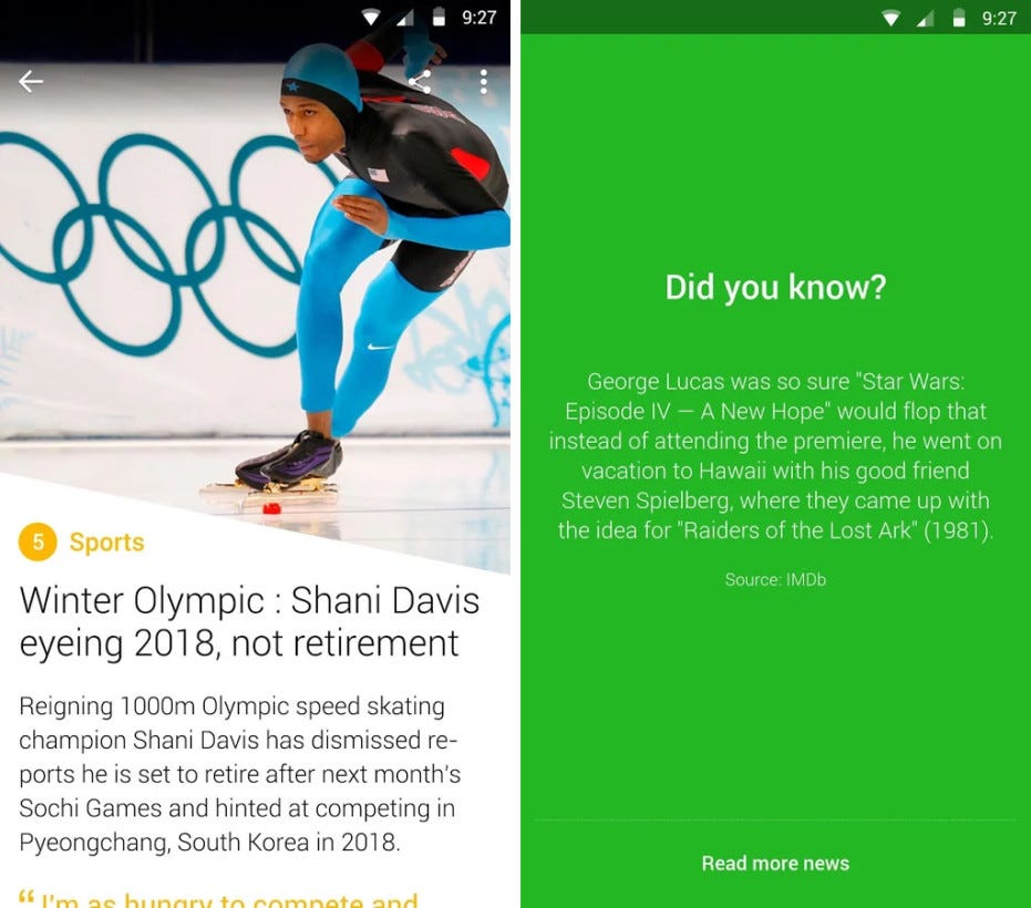
I often miss news apps I used a few years ago, such as Circa (closed in 2015) or Yahoo News Digest (axed in 2017). Both apps, in a different way, offered mobile-friendly news consumption. Yahoo’s app updated twice a day, in the morning and evening and it offered short, summarized news stories from around the world along with a tweet or “did you know?”. The stories were mostly summarized through technology, which Yahoo acquired from a then
17-year-old.
On the other hand, Circa did not only try to make news more mobile-friendly by serving it in small snippets, but also made it easier to follow a story as it unfolded over multiple days, as human editors added more of these snippets or updated details. This is something I still haven’t been able to fully replace. TechCrunch wrote about the app’s launch in 2012:
“Here’s the typical experience of someone who reads news on their mobile phone: you see a link on Facebook or Twitter and you’re sent to a long mobile page, hopefully, and you’re then able to start reading. Galligan tells me that this experience is broken. Why? Because when you’re on a mobile device, you don’t really have the time to read an entire article, and you’re really looking to “snack” on the important bits and pieces about what’s going on in the world.”
If you ask me, this experience is still fairly unchanged today. Efforts from smaller companies have come and go, but bigger parties such as Facebook and Google launched initiatives like Instant Articles or AMP, which succeed in making pages load faster on mobile devices (although AMP offers an inferior experience compared to the normal website, in my opinion), but research has found that news is simply consumed differently on mobile devices, compared to computers. “Screen size is positively correlated with ease of reading, clarity and organization of information, and negatively correlated with reading time”.¹
Does it then really make sense for a New York Times article to have a shared reading experience for desktop and mobile? Especially when considering that “Attention — an important precursor for recall, learning, and the ability to discern fact from fiction — is curbed on mobile devices. Even as mobile access proliferates, for the mobile dependent, the depth of attention to news is shrinking.”¹
I’m not suggesting that there is no room for longform, in-depth news or background stories, but given that the Reuters 2020 Digital News Report² states that 69% of people access news through mobile devices (mostly via social media), I’m merely wondering if in this way The Times, as per their mission statement “we seek the truth and help people understand the world”, is helping in the right ways.
So if mobile news consumption should be different, why did the apps I mentioned eventually fail? There’s a multitude of reasons, but one of them might have been that on mobile, people still mostly rely on the big familiar brands.³
A few years ago, NYT also realized that the way people read news on mobile devices, or the moment at which they do, is different from desktop. They built NYT Now, a mobile-only experience that offered shorter stories for $8 a month. Essentially, it was an attempt to attract (younger) people who have never been interested in buying a newspaper or getting a subscription. It wasn’t hugely successful and the service continued as a free app a little over a year after the initial release.

But even after that change, it never really took off. Facebook and other social feeds had simply gotten too big by that time. And that’s where we are today; most news media have shifted their focus to those (external) platforms, to big audiences. Most of these platforms have specific features that news media are using to their advantage, such as (live) video.

Above you see a way how NYT utilizes Instagram Stories and I think that’s a great mobile format. The downside is that this report is sandwiched between other posts, which basically contain a header, an image and a link to the full article. It’s also available for only 24 hours. NYT uses Highlights to pin some stories on specific topics to their profile, which now is a very long horizontal list, bad for discoverability. This is unfortunate, because the Highlights format is a great way to add to stories over time. In other words, the suit fits, but it’s not tailor-made.
Audio has also been on the rise for the last few years. Last year, it was announced that The Daily podcast from NYT reaches 2 million people. There are more long-form daily podcasts, such as the Guardian’s Today in Focus, but also short-form, like NPR News Now or CNN Daily News Briefing (I listen to this format as part of my Google Assistant “good morning” routine). Podcasts are mostly consumed on mobile devices⁴ and news podcasts mostly reach people aged 25–34².
While these are nice additions to the mobile news experience, they are nothing more than that. The main ways to consume news on mobile still are directly through websites or algorithmic feeds on social media and aggregators. News offerings might have become smarter by being more personalized (I love my filter bubble), but have still not fully adapted to how we use smartphones.
¹
https://academic.oup.com/jcmc/article/23/2/107/4952048?guestAccessKey=9abdfdf2-49a5-4fb3-898c-f4756690b65e


